In classrooms and study halls, one term has been gaining momentum: data visualization. It is not just the buzzword of tech conferences; it has become a skill that helps students grasp complexity in a world saturated with numbers. Whether you are breaking down a science experiment, analyzing survey results, or presenting your thesis, the ability to turn raw data into visual form is a decisive academic advantage. For students under constant deadlines, finding ways to manage workload and use supportive resources is equally vital. Many peers look for research guidance, and an APA paper writing service often becomes a lifeline in balancing projects. Right after choosing reliable support, students still need to master how visual literacy can amplify their academic voice.
Why Visualization Matters More Than Ever
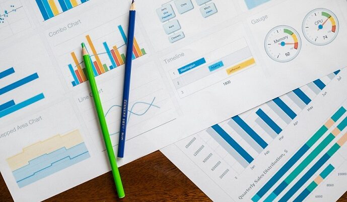
The digital landscape pushes information at a pace no textbook ever matched. Reports, spreadsheets, and charts pour into classrooms daily, leaving many overwhelmed. Visualization converts those intimidating blocks of numbers into forms that the brain can scan and interpret quickly. A simple line chart can reveal a rising trend in global temperatures. A bubble diagram can highlight correlations between income and education levels. Students who can use these tools not only comprehend faster but also communicate findings with clarity.
This is not just about improving grades. Employers from business fields to public health demand strong data storytelling. Graduates who enter the workforce already equipped with visualization skills set themselves apart. Tools like Tableau, Power BI, and even the chart functions in Google Sheets or Excel make this competency accessible without heavy coding expertise.
The Psychology of Seeing Patterns
The human brain processes images far faster than text. Researchers estimate that visuals are interpreted up to 60,000 times quicker than written words. That explains why charts or infographics often linger in memory longer than a lengthy paragraph of statistics. For students juggling multiple courses, this cognitive advantage becomes a study hack in itself.
Visual patterns also make abstract ideas concrete. Consider economics: supply-and-demand curves often say more in one sketch than a page of explanation. In psychology, mapping correlations between stress levels and exam performance illustrates concepts immediately. Recognizing these mental shortcuts gives students a learning edge.
Student Hacks for Data Visualization
Start Simple, Then Expand
No one has to begin with complex dashboards. Start with bar graphs or pie charts in Google Sheets. Once comfortable, move into interactive visualizations with platforms like Flourish or Tableau Public.
Leverage Templates
Many tools provide built-in templates. Students should not reinvent the wheel when a ready-made format highlights trends more effectively. Templates ensure professional presentation even under time pressure.
Pair with Writing
Every chart needs interpretation. The danger lies in assuming visuals speak for themselves. Clear captions and supporting text help audiences understand the story behind the figure. Here, an APA paper writer can offer a model of how visual elements integrate seamlessly into structured academic prose.
Collaborate
Group projects benefit from dividing tasks: one student gathers data, another builds visuals, and another frames the analysis. Collaboration mirrors workplace practice and ensures stronger outcomes.
Academic Integrity and Visualization
Charts are powerful, but they can also mislead. Students must stay vigilant about scale manipulation or selective data usage. A bar chart with a truncated axis can exaggerate small differences; an omitted dataset can skew interpretation. Ethical standards apply just as much in visuals as in written arguments. Universities increasingly teach these responsibilities alongside research methods.
For students pressed for time, shortcuts like APA papers for sale may seem tempting. Yet academic integrity calls for cautious decisions. Visualization, when learned properly, becomes a personal skill no service can replace. Ethical use ensures credibility and respect from peers and professors alike.
How Visualization Connects With Writing Standards
Academic work demands structure, and nowhere is this clearer than in citation styles like APA. Properly labeled figures, consistent formatting, and clear legends make visuals fit within scholarly frameworks. Many students struggle not with creating a chart, but with inserting it into a research paper correctly.
Services like WritePaper often provide guides that show how figures should be captioned, numbered, and referenced according to APA rules. Following these guidelines prevents costly formatting mistakes that lower grades. Understanding the dual role of visualization and formatting bridges technical and academic requirements.
Career Applications Beyond Campus
Visualization is not confined to school. Health professionals interpret patient data visually to spot emerging risks. Urban planners map population density to guide housing projects. Marketers create dashboards tracking customer engagement. Students who learn visualization early step into careers with practical tools ready.
When graduates highlight these skills on resumes, employers recognize adaptability. A job candidate who can say, “I used Tableau to analyze and present survey data for a capstone project,” already signals proficiency beyond theoretical knowledge. This positions them as contributors who can turn insight into strategy.
Balancing Workload While Learning Visualization
Adopting visualization skills does not mean ignoring existing academic pressure. Many students already struggle with balancing assignments, exams, and part-time jobs. Asking, write my apa paper for me, becomes a question of survival during peak exam weeks. While support services can help manage writing tasks, visualization practice fits neatly into downtime. Ten minutes experimenting with chart functions in Excel can yield progress without overwhelming schedules.
The best approach is gradual: integrate one new visualization type per semester. By senior year, a student has a toolkit of formats suitable for various disciplines. Small steps compound into strong competence.
Anticipating the Future of Data Literacy
Artificial intelligence is pushing visualization further. Tools that automatically generate graphs from raw inputs are becoming mainstream. This does not eliminate the need for student skill; it increases the demand for critical interpretation. When software produces dozens of charts instantly, the human task is to decide which visuals tell the clearest and most honest story.
Students who train themselves now will not just follow AI trends but lead them. The next generation of professionals must evaluate data both visually and ethically, understanding the line between simplification and distortion.
Conclusion: Visualization as a Core Student Skill
Data visualization is more than a passing academic trend. It is the language of modern knowledge, a way to see patterns, communicate findings, and build credibility. Students who embrace it are not only improving their grades but shaping career readiness.
Balancing this learning with deadlines can be tough, which is why knowing where to find structured support matters. Reliable services help manage written tasks, while visualization becomes a skill to carry for life. Together, they form a combination that ensures clarity, integrity, and future opportunity in both academic and professional landscapes.

